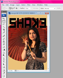
This shows adding text, i have clicked on the second icon on the left hand side which will allow me to create a text box.

This shows adding the main imageas you can see I have placed it behind the masterhead and have positioned my model to the right hand side.
This shows all my coverlines, as you can see i have followed a general "Z" layout
This shows the finish product, i have included my masterhead, main image, insert, coverlines, flash button, barcode, skyline and website and price, making it a realistic magazine.
Contents:
This shows adding background and masterhead, my background colour is set to grey, and i have inserted an image i created on "Dafont", i then angled it so it rain along the right hand side of the magazine.
This shows adding my main image, i have placed my model on the right hand side, leaning againstthe masterhead, at the bottom i have a montage where i have added two inserts and placed them together, close to the main image.
This shows that i have added text, i have placed them on the left had side, as naturally the eye is drawn towards the left, as the text is the information i want to stand out i have put it on the left in the colours of yellow and purple.
This shows the finish product, i have added my masterhead, model, montage, text and background, the page number and website remains continuous and is found at the bottom on every page.
Double Page:
This shows adding background and main image, i have placed my model on the left hand size, so she covers up a page.
This shows the masterhead added, i have placed the masterhead ontop on my model to make it more interesting and unique
This shows the final product with all text added, i have added text on the left hand side and made it follow how a magazine looks like as i have included columns. i have included an insert aswell and i quote from the interview.


