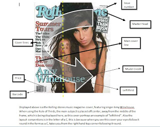
To make a magazine successful there are certain layout and conventions which allow a magazine to sell more. Magazines are laid out with the reader in mind, the common layout of magazines are in the letters of "C", "T", "Z" "F" and others, this is because this is how the reader follows the magazine, if the magazine has shaped its contents in a form of a "C", the reader automatically follows this "C" which their eyes, making the magazine more dominant as it directs the reader and navigates them around the magazine.
Layouts include having a clear masterhead when a new topic is introduced, however when having a type face to portray the masterhead, a limit of only three different type faces should be used, this allows variation to be used, yet keep the consistency of the magazine itself
On the front cover there should also be center of visual impact eg: the focal point. The attracts the reader and ties all the another elements together
the use of text and visual images to create consistency throughout the magazine to create an identity, however too much text and images shouldn't be over used as it will overwhelm and crowd the reader
a limit of four consistent colours should be used, colours that compliment each other and work good together in order to tie the magazine together. a maximum of four different colours allows experimentation to be shown as well as keeping the consistency and familiarisation
A genre should be established and everything in the magazine should relate back to the genre, therefore successfully attracting the target audience
Below is a magazine, the layout and conventions are displayed of the front cover of a rolling stones magazine:

No comments:
Post a Comment