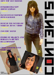
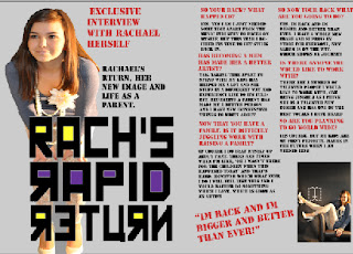
This is the final product of my magazine, as you can see i have followed my plans and have created a successful magazine which follow existing layout and conventions, yet have put my own stamp on the product.
Conclusion:
Whilst researching different magazines I have discovered various constantly used elements which allow magazines to be appealing and successful. Taking ideas from existing magazines, i will try and incorporate these ideas into my own magazine, yet also challenge conventions.
conventions:
- After analysing magazine, I noticed that most coverlines are found on the left third (The Rule of Thirds), this is because the focus is mainly always there, and therefore important information is demonstrated here.
- The masthead is always located at top of each page. It is larger than the rest of the text and is presented in bold, making it noticeable and stand out. Billboard, Vibe and rap up all have bold block letters, they don’t appear “girly”, it appears to be strong and dominant, taking charge of the page. It tends to be simple and easy to read, therefore not confusing the reader or making them misunderstand what is being shown
- After analysing magazine, I noticed that most coverlines are found on the left third (The Rule of Thirds), this is because the focus is mainly always there, and therefore important information is demonstrated here.
- The models used are usually dressed depending on the genre, in the magazines I have looked at the models are all dressed up and wear jewellery which are commonly displayed conventions
- Each magazine provides a barcode, dateline, website and a price. This are displayed to provide the reader with information the reader wants to know
- The images used are of popular artists that the magazine genre cater for. The images are shown in different ways, normally on the contents page, montage of images are displayed, this is done to match images to the information. Normally there is a main image of an artist on the front cover and will contain small insert images of another artists.
- The colour scheme used it fairly simple and consists of three main colours – therefore not taking too much attention away from the information and does not overcrowd the reader. Colours used are not to bright for the reader, conventional colours include: Black, White, Red, Blue....
- Each magazine provides a barcode, dateline, website and a price. This are displayed to provide the reader with information the reader wants to know.
- Page numbers are constantly shown on every page – making it easier to navigate around the magazine
- The double page spread always consists of one main image along with various amounts of text and has the magazines name and website located at the bottom. It also shows to have pull out quotes and images
- Both contents pages have page numbers next to each image which link to the writing, this is done with the reader in mind as it makes it easier to navigate the magazine
- The target audience for the magazines are young males and females; this is because of the genre and the artists used.
- What is featured on the front page, is a what the double page spread features
After analysing these big known successful magazines, I have gained ideas on how I can incorporate existing ideas into my magazine.
- The main image on the front cover will be big and dominant the page
- The masterhead will be big and in a bold capital font, yet will still be unique
- Coverlines will be located on the left of the magazineThere will be a constant use of three colours throughout the magazineThere will be one main image on the double page spreadPullout quotes will be usedthe contents page will have a montage of images which will be numbered according to the page numbersPage numbers, website and magazine will be present on each pageBarcode and price will be shown along with the issue number


No comments:
Post a Comment