Saturday, 31 December 2011
Questionnaire
This video is evidence of how my mind was made up and what influenced me when creating my magazine. When creating my own magazine i wanted it to be as successful as it can be, therefore i have done some background research. My chosen genre is girly RNB/hip hop, therefore i made a questionnaire and presented it to fellow students within my school as they are the main target audience that i wish to appeal too. I printed off various front covers of current hip hop/RNB, such as rap up, Billboard and vibe and got feedback on what was liked about each cover. I then Chose typefaces that are commonly used on music magazines and what i would consider to use, however as my magazine would be sold to my target audience i decided to get their opinion on the typefaces and use the most popular choice. Another question presented to the target audience i how often they buy and magazine and where from, this gives me an insight on how much to base my own magazine around and where commonly they are sold, therefore expanding my knowledge on the magazine distribution process. Within the magazine interesting topics need to be embedded, therefore one question was "what interests you most in a magazine", this allows me to see what to feature within my magazine, one of the choices were "interview with celebrities", this was a popular answer, which is why when creating my magazine a celebrity interview was decided to be feature on my double page spread.
Friday, 30 December 2011
Case Study
This is evidence to show my research of an institution - NME... this shows all background research and history and where NME is recognisable
Behind the scenes
This is a test shot showing images that i considered using, when creating my contents page i wanted insert images of this main model, this is evidence showing the experiments made. However this images wasnt successful as the model isnt showing much facial expression and there is a gap in her fringe.
For my double page spread i wanted one whole image of this model, this is one position i experimented with, this image allows the model to be "thinking" and not giving direct eye contact. However when chosing my image i didnt feel this image was successful as the model seems lifeless and not focused
This is another image, this is an improvement from the last image as the model is now smiling and looking at the camera, however this position wasnt successful.
This is another position i made the model try, however this image wasnt successful as the model wasnt ready and the camera shot wasnt good as you can see the setting in the background.
This is another image i tried, i wanted the model to look cool and casual, however certain elements ruined the picture, for example: the models shadow is in the way and the background that they are posing in front of creased and torn.
Thia is an image i thought it could use for my front cover, however the shot type isnt good as it is too far away and the lighting shown isnt appealing and doesnt show the model in a effective way
This is another image that was considered for the double page, however the lighting is too dark, making the picture lose its quality
This is an image i was considering to use, as you can see i have editted the image, took away the background, however this is not to final image i decided to go with as i thought it wasnt the best image taken
Image Planning:
In order to take my pictures i have created a table to record all my ideas of how I would like each image to turn out. I have included where it will be taken, at what time and what will be needed. This keeps me organised and help me remember what i need to bring along with me and allows me to book out the locations needed
Front cover picture planning
Contents page picture planning
Double page picture planning
Final product
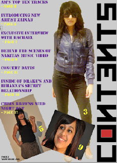
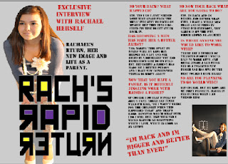
This is the final product of my magazine, as you can see i have followed my plans and have created a successful magazine which follow existing layout and conventions, yet have put my own stamp on the product.
Conclusion:
Whilst researching different magazines I have discovered various constantly used elements which allow magazines to be appealing and successful. Taking ideas from existing magazines, i will try and incorporate these ideas into my own magazine, yet also challenge conventions.
conventions:
- After analysing magazine, I noticed that most coverlines are found on the left third (The Rule of Thirds), this is because the focus is mainly always there, and therefore important information is demonstrated here.
- The masthead is always located at top of each page. It is larger than the rest of the text and is presented in bold, making it noticeable and stand out. Billboard, Vibe and rap up all have bold block letters, they don’t appear “girly”, it appears to be strong and dominant, taking charge of the page. It tends to be simple and easy to read, therefore not confusing the reader or making them misunderstand what is being shown
- After analysing magazine, I noticed that most coverlines are found on the left third (The Rule of Thirds), this is because the focus is mainly always there, and therefore important information is demonstrated here.
- The models used are usually dressed depending on the genre, in the magazines I have looked at the models are all dressed up and wear jewellery which are commonly displayed conventions
- Each magazine provides a barcode, dateline, website and a price. This are displayed to provide the reader with information the reader wants to know
- The images used are of popular artists that the magazine genre cater for. The images are shown in different ways, normally on the contents page, montage of images are displayed, this is done to match images to the information. Normally there is a main image of an artist on the front cover and will contain small insert images of another artists.
- The colour scheme used it fairly simple and consists of three main colours – therefore not taking too much attention away from the information and does not overcrowd the reader. Colours used are not to bright for the reader, conventional colours include: Black, White, Red, Blue....
- Each magazine provides a barcode, dateline, website and a price. This are displayed to provide the reader with information the reader wants to know.
- Page numbers are constantly shown on every page – making it easier to navigate around the magazine
- The double page spread always consists of one main image along with various amounts of text and has the magazines name and website located at the bottom. It also shows to have pull out quotes and images
- Both contents pages have page numbers next to each image which link to the writing, this is done with the reader in mind as it makes it easier to navigate the magazine
- The target audience for the magazines are young males and females; this is because of the genre and the artists used.
- What is featured on the front page, is a what the double page spread features
After analysing these big known successful magazines, I have gained ideas on how I can incorporate existing ideas into my magazine.
- The main image on the front cover will be big and dominant the page
- The masterhead will be big and in a bold capital font, yet will still be unique
- Coverlines will be located on the left of the magazineThere will be a constant use of three colours throughout the magazineThere will be one main image on the double page spreadPullout quotes will be usedthe contents page will have a montage of images which will be numbered according to the page numbersPage numbers, website and magazine will be present on each pageBarcode and price will be shown along with the issue number
Wednesday, 28 December 2011
Tuesday, 3 May 2011
Screenshots for creating magazine
Front cover:
This shows adding text, i have clicked on the second icon on the left hand side which will allow me to create a text box.
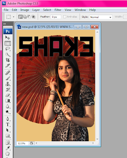
This shows adding text, i have clicked on the second icon on the left hand side which will allow me to create a text box.

This shows adding the main imageas you can see I have placed it behind the masterhead and have positioned my model to the right hand side.
This shows all my coverlines, as you can see i have followed a general "Z" layout
This shows the finish product, i have included my masterhead, main image, insert, coverlines, flash button, barcode, skyline and website and price, making it a realistic magazine.
Contents:
This shows adding background and masterhead, my background colour is set to grey, and i have inserted an image i created on "Dafont", i then angled it so it rain along the right hand side of the magazine.
This shows adding my main image, i have placed my model on the right hand side, leaning againstthe masterhead, at the bottom i have a montage where i have added two inserts and placed them together, close to the main image.
This shows that i have added text, i have placed them on the left had side, as naturally the eye is drawn towards the left, as the text is the information i want to stand out i have put it on the left in the colours of yellow and purple.
This shows the finish product, i have added my masterhead, model, montage, text and background, the page number and website remains continuous and is found at the bottom on every page.
Double Page:
This shows adding background and main image, i have placed my model on the left hand size, so she covers up a page.
This shows the masterhead added, i have placed the masterhead ontop on my model to make it more interesting and unique
This shows the final product with all text added, i have added text on the left hand side and made it follow how a magazine looks like as i have included columns. i have included an insert aswell and i quote from the interview.
Mood Boards
This is a mood board, showing all the different shades of red, i have done this to experiment with colour and also to see which images look nice, i have included thinks that i think relate to a music magazine. i have chosen to use red when creating my magazine as red is used for love and lust, this is a common topic that artists sing/rap about, also the colour is a commonly used convention in magazines, therefore i decided to use it when creating my own magazine in hope that it will appeal to existing magazine buyers.
This is a mood board for the colour yellow, i have experimented with different shades and images of the colour yellow to show my develeopment and to see what items are yellow, i think these images relate to my music magazine for example the yellow trainer, as my genre is rnb this goes well with it and the trainer looks like somethink a rap singer would wear. Yellow is a bold bright colour therefore it will compliment and contrast with the other two chosen colours
main magazine ideas on Prezi
contains: typefaces, flat plans, coverlines, masterheads, colour schemes
Thursday, 27 January 2011
double page spread comparison
extra analysis:
Both double page spread consist of paragraphs, the breakdown of paragraphs makes it easier for the reader as they can take in certain amounts of information at a certain time. Both also contain a balance of visual images as well as text, however the shot types are different, the one of Usher is a mid shot, this allows a clear image of him, his clothing, the closeness of the image allows the magazine to be more "in your face" and appealing as they recognise the artist . The second double page spread there is a long shot of the model, this is done to see her who figure which is an appealing element, you can see the clothing and her body language, the model is standing up right in a dominant pose. Unlike the Usher page, the page with the female artist has more than one picture, running along the top of the magazine is a role of images of the same model just in different positions, this is effective as it shows the movement of the character, showing her different personalities and allows the reader to see the different sides to her. The use of the full length image being the only one in colour makes the image stand out more, when flicking through a magazine the reader will come across a bright big image, making them look at the page more, therefore encouraging them to read the article. Pull out quotes are a commonly used convention for a quick glance, these pull out quotes give an in sight of the artists life, the pull out quotes stand alone from the article, this interests the reader as it is straight from the artist themselves.
contents comparison
Extra analysis:
Both contents pages are different, the "vibe" (left) has a model in tight clothes showing her legs, the use of revealing skin (legs) along with heels shows the dominance woman have, their seductive techniques that can attract the readers. However "Billboard"(right) is more playful and energetic, this is shown through the bring all in one outfit and the upright position of the model. The "Vibe" magazine only has one model showing the power the one model has, however the "Billboard" magazine has a montage of images located on the right, the montages are all of men, attracting both males and females, the montage images are much darker in comparison to the billboard, the opposite colours used could show the different levels the magazine has. Both images on both magazines are a long shot, this is done to give the reader everything, the facial expressions and the clothing used. The colours in both magazines vary, the dull dark colours in "Vibe" could signify mystery and enigma as it is all shadowy and unknown, also the model doesn't appear to be smiling. Whereas "Billboard", the model seems happy and is placed on a white background, symbolising purity, this could show that the model isnt hiding anything from the reader, "what you see is what you get". The masterhead "Contents" in shown to be located at the top of the page, following stereotypical conventions, however the layout of the wording is different, "Vibe" is distorted, perhaps to show how unique and different their magazine is, whereas "billboard", the contents appears in one line at the top, making it simple and familiar to the reader. Both magazines have a similar target audience between the ages of 16-25, this is because the models used are well known celebrities, therefore this target audience will recognise this and what to continue reading. "Billboard" follows conventions as the writing is all on the left hand side, this is commonly used and allows the reader to be familiar with this layout, therefore comfortable with navigating their way through the magazine. "Vibe" however challenges this idea and has the writing to the right, this maybe done to make the magazine stand out and be recognised and kept in the readers memory due to the difference in layout. Both typefaces are bold and strong, this could connotate the magazine, it is powerful and dominance as it shows the reader what they want to see. "Billboard" has the magazines name located at the top right hand corner to remind the reader, however "Vibe" doesn't show this, however it does show a big outline of the letter "V" which is located near the masterhead, this could stand for the magazines name "Vibe", the random letter on its own is noticeable therefore makes the reader think what is stands for, therefore publishing the name.
Front cover comparison
Extra analysis:
In both magazines the long shot is taken of the model, this is done to show their dominance, the fact that a whole length image needs to be shown of them, their dominance is also shown as they cover a bit of the masterhead, this emphasises that they are the most important thing on the page, this is magnified as their are no insert images, only them. There isnt much writing or coverlines on the front page, this keeps the front cover very simple yet effective as this creates enigma as information isnt revealed. In "Flavour" the writing matches the colour of the model's dress, this is done to show the direct link between the two, making it easier for the reader to understand. The colours used in "Rap up" are very unisex, therefore making the target audience range broader, the colours used in "Flavour" are very girly as there are a lot of pink used. Due to the clothings and models used, these magazines would be aimed at females from the age of 16-25 who have an interest in these artists. In both magazines the models reveal skin, in "Flavour" more skin is visible, therefore making it more seductive. Both women are wearing going out clothes, along with heels, done up hair and make up, this all adds to their persona and adds to create the whole magazine more RNB. In both magazines different conventions are shown showing the variation between them two, in "Rap Up" a skyline is shown and in "Flavour" issue number is shown. Both magazines lack the sterotypical conventions, there is no barcode, price, website or writing visible, making the magazine enigmatic as nothing has been given to help the reader. The typeface in "Rap up" is cleverly used, the "U" has an arrow putting up, this could be because their magazine is "Rap up", so the arrow connotates "UP". The type face in "Flavour" is very basic and simple, making the name of the magazine have more power then the style of it.
Saturday, 8 January 2011
Analysis of front cover (2)
Extra analysis:
There is only one main image, the lack of insert images and montages allows all the focus to be on the main image, this shows the importance she has. Another thing to show how important the model is, is the fact that she is covering some of the masterhead, even though the reader cannot see the full masterhead, some of it can be seen and the fact that the magazine is so popular, the readers can understand what the name of the magazine is, "Billboard". Conventions are following, information is located on the left half of the magazine, this is where the reader's eye focus is drawn to, therefore cleverly the information is shown here. A website is commonly shown on a magazine, normally it is small and in the corner, however in this case it is big and bold and is located at the bottom on the page, this is done to allow the reader to see that there are different ways for them to read the magazine, therefore making it reader friendly and make the reader feel like the magazine has them in mind. The bright colours and the well known celebrity indicates that this magazine is for the male and female popular between the ages of 16-25 who can recognise the celebrity.
Analysis of front cover (1)
Connotation:
from this image we notice that one of the boys is grabbing his shirt in anger to show power and frustration. Also each male are on different level platforms on the cover, perhaps showing variation of their band, to show who is the more important figure or perhaps this is done to make them and the magazine appear more superior. The mid shot allows the audience to see majority everything, such as the models clothing, this is useful as the audience sometimes base their dress sense depending on celebrities. Mid shot makes the image seem more realistic and natural, making the reader connect more
Denotation:
This is a mid sot image of an all male band called “JLS” who are all looking directly at the camera in different positions with intimidating facial expressions.
Conventions:
The master head is in gold block capitals and on top of a black background this is done to make the master head more eye catching as it is more noticeable. Stereotypical conventions are shown, for example: having the masterhead at the top and the skyline at the bottom this makes the audience familiarise themselves with the magazine. The main cover lines are in bold white and skyline is a mixture of gold and white. Also the website is located at the top right and the issue number is directly opposite on the right. Clear noticeable conventions are shown to make it easy for the reader to navigate
Camera angel/shot type:
The shot type which is being displayed is a mid shot which is done to unravel the body language, which is aggression and also to reveal clothing to the audience.
Colours:
the main colours used are gold, black and white. Gold is a warm colour that can be both bright and cheerful, however the use of gold could also mean gold standard – the best, a measure of quality, excellence, which the magazine might portray itself to be. Another colour used is black, conveying elegance, sophistication or a touch of mystery. Whereas white symbolises purity, cleanliness, innocence and goes well with almost any colour. The colours used a very rich and important showing the quality of the magazine
Enigma and ambiguity:
the models are looking directly at the same showing that there isn’t any mystery; this could indicate to the reader that in the magazine there are not going to hide anything from the reader, making them interested in buying the magazine. It also the lack of mystery and gestures show their purity, they are simple, which sends a more powerful message.
Layout style:
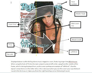
The layout conventions is in the letter of a C, this is because when you see this cover your eyes follow it round in the form as a C, takes you from the right hand top corner following it round. Also the rule of thirds maybe used as the line falls on the models eye view. The use of the C makes it easier for the reader to navigate as a clear simple layout is done in order to allow the reader to follow and make the magazine seem less compact.
Mise-en-scene.
The background is a simply light grey which is done maybe to emphasis the focus of the models. The main colours are black white and gold which are neutral. They are wearing simple clothing which perhaps is done so the reader can feel that they can relate to them. The image is the background of the magazine symbolising the importance of the models. Their styling of clothing is cool casual trendy which appeal to the target audience, making a direct link between the reader and the magazine. The information isnt too much and there is a balance between visual images and text. There are no insert images just one main focal image which covers the whole page showing the bands dominance. Encouraging words such as “award winning” are displayed to draw the reader in, making them feel like they wouldn’t want to miss out on a big story.
Shot types/ Camera angles
Shot types and camera angles that i could use to create my magazine:
- wide shot - this is where the subject takes up the full frame in this shot, it allows the audience to see a full length image of for example a person
- mid shot - this shot type allows the audience to see the person in more detail, whilst still showing enough for the audience to feel as if they were looking at the whole subject
- close up - this is when a certain feature or part of the subject takes up most of the frame, for example the face, this close up image shows more details, it emphasizes their emotional state
- Low angle shot - shows the dominance of the model, below eyeline
- High angel shot - above the eyeline, this is used to show a different perspective
- Over the shoulder - this shows an shot where one person is in view and only the back on the other person head is shown. this is a conventional shot to use for a montage as it shows normality, a casual shot taken
- Two shot - this is a shot where two people are in the frame, this is a good shot to use as it shows the relationship between the two people, a "surprise" picture could have been taken and used in the magazine between two celebrities therefore making the reader want to know what is the link between them two.
Rule of thirds
The rule of third is that one of the most popular elements in photography, The Rule of Third is basically imagining an image which has been split into thirds so that there are 9 different parts. The rule states that an image should be imagined as divided into nine equal parts by two equally-spaced horizontal lines and two equally-spaced vertical lines, and that important compositional elements should be placed along these lines or their intersections. Using the Rule of Thirds helps produce nicely balanced easy on the eye pictures.
As you can see here there are 9 different sections.
example:
If you look at this image you can see that the model is on the left hand side of the frame, this has been done as it is proven that a humans eye automatically looks to the left of an image the evidence of this is the fact that humans read from left to right too. By placing her in the centre of the frame is could result in an “awkward” shot.
Layout and Conventions
This is an other example of layout and conventions on another front cover, as you can see this magazine has clear simple yet effective layout and conventions
Layout and Conventions
To make a magazine successful there are certain layout and conventions which allow a magazine to sell more. Magazines are laid out with the reader in mind, the common layout of magazines are in the letters of "C", "T", "Z" "F" and others, this is because this is how the reader follows the magazine, if the magazine has shaped its contents in a form of a "C", the reader automatically follows this "C" which their eyes, making the magazine more dominant as it directs the reader and navigates them around the magazine.
Layouts include having a clear masterhead when a new topic is introduced, however when having a type face to portray the masterhead, a limit of only three different type faces should be used, this allows variation to be used, yet keep the consistency of the magazine itself
On the front cover there should also be center of visual impact eg: the focal point. The attracts the reader and ties all the another elements together
the use of text and visual images to create consistency throughout the magazine to create an identity, however too much text and images shouldn't be over used as it will overwhelm and crowd the reader
a limit of four consistent colours should be used, colours that compliment each other and work good together in order to tie the magazine together. a maximum of four different colours allows experimentation to be shown as well as keeping the consistency and familiarisation
A genre should be established and everything in the magazine should relate back to the genre, therefore successfully attracting the target audience
Below is a magazine, the layout and conventions are displayed of the front cover of a rolling stones magazine:
Subscribe to:
Comments (Atom)


